Translate
Aspect Ratio Calculator: Resize Images Without Distortion

Aspect Ratio Calculator: Resize Images and Videos Without Stretching
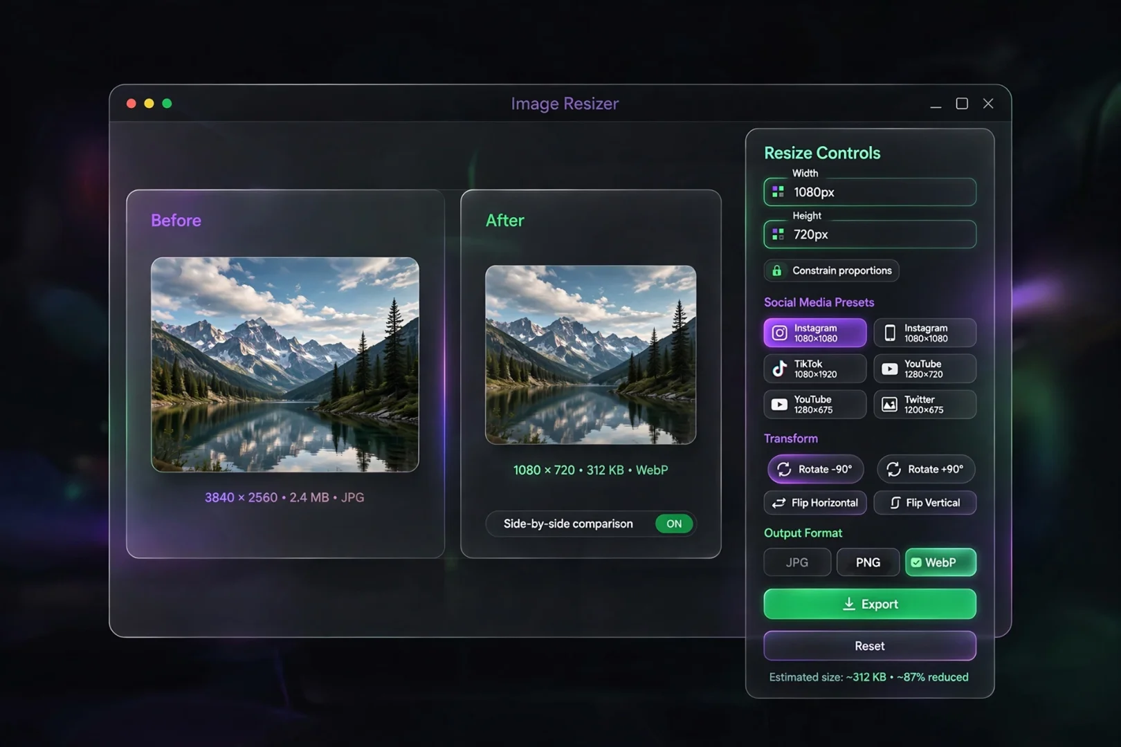
Have you ever resized an image only to find that people look unnaturally tall, circles become ovals, or your YouTube thumbnail appears cropped? These problems almost always come down to one thing: the aspect ratio.
Whether you're designing a website, editing photos, creating videos, or preparing graphics for social media, maintaining the correct proportions is essential. Even a small mistake can make professional work look unfinished.
Our Aspect Ratio Calculator helps you calculate dimensions instantly, find missing widths or heights, compare different screen formats, and even generate responsive CSS for web projects, all directly in your browser.
What Is an Aspect Ratio?
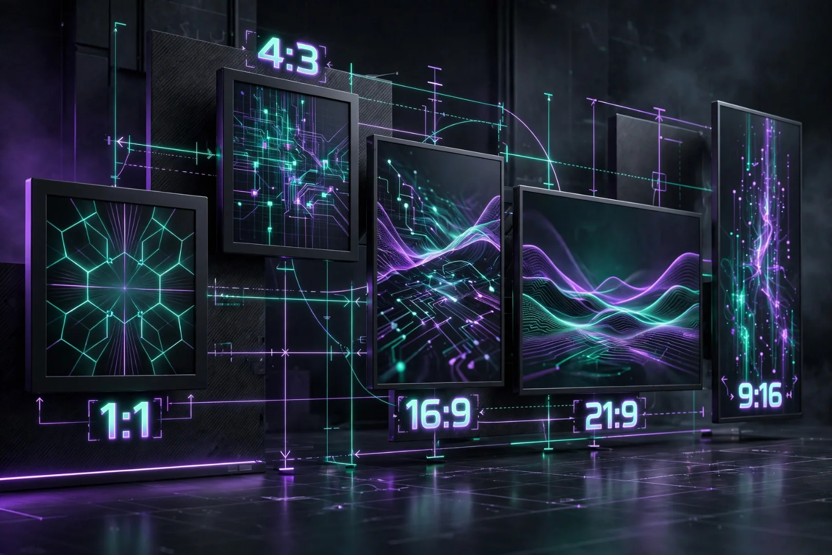
An aspect ratio describes the relationship between the width and height of an image, screen, or video.
Instead of measuring actual pixels, it compares the proportions.
For example:
Resolution | Aspect Ratio |
|---|---|
1920 × 1080 | 16:9 |
1280 × 720 | 16:9 |
1080 × 1080 | 1:1 |
1080 × 1350 | 4:5 |
3840 × 2160 | 16:9 |
Although the resolutions are different, the proportions stay the same.
Why Aspect Ratios Matter
Maintaining the correct aspect ratio prevents:
Stretched images
Squashed videos
Distorted logos
Cropped content
Black bars on videos
Blurry image resizing
Whether you're uploading content to YouTube, Instagram, TikTok, Facebook, or your own website, choosing the correct ratio helps preserve image quality and creates a more professional appearance.
How Our Aspect Ratio Calculator Works
Our calculator goes far beyond simply displaying a ratio.
It includes several specialized tools designed for different workflows.
Calculate Aspect Ratio
Enter any width and height.
The calculator automatically:
Simplifies the ratio using mathematical reduction
Displays decimal and percentage values
Calculates total pixels
Calculates megapixels
Calculates diagonal pixels
Generates responsive CSS
For example:
1920 × 1080

↓

16 : 9
No manual calculations required.
Find Missing Width or Height
Sometimes you already know one dimension.
For example:
Width = 1280 px
Ratio = 16:9
The calculator instantly determines the correct height.
Likewise, if you know the height, it calculates the matching width while keeping the proportions perfect.
This is especially useful for responsive web design and image resizing.
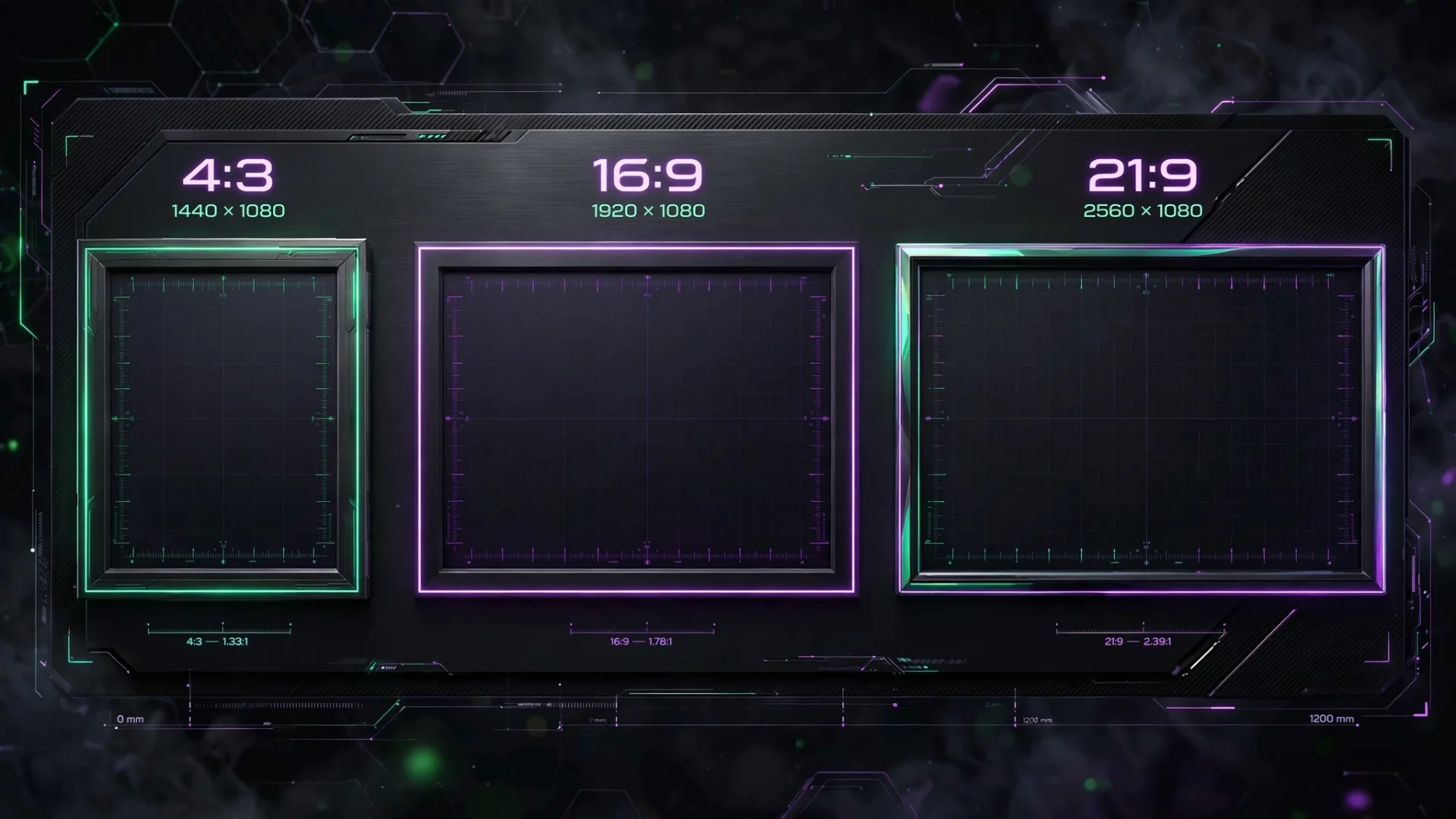
Compare Two Aspect Ratios
Need to compare a standard monitor against an ultrawide display?
The comparison mode lets you:
Compare visual proportions
Compare total pixel counts
View both shapes side by side
Understand how much extra screen space one format provides
This feature is particularly useful when choosing monitors or designing layouts for multiple screen sizes.
Calculate Physical Screen Size
Developers often know a monitor's resolution but want to understand its actual size.
Simply enter:
Screen diagonal
Resolution
Pixels Per Inch (PPI)
The calculator provides:
Width in inches
Height in inches
Width in centimeters
Height in centimeters
Display quality rating
This makes it easier to compare monitors, TVs, tablets, and laptops before buying.
Responsive CSS Generator
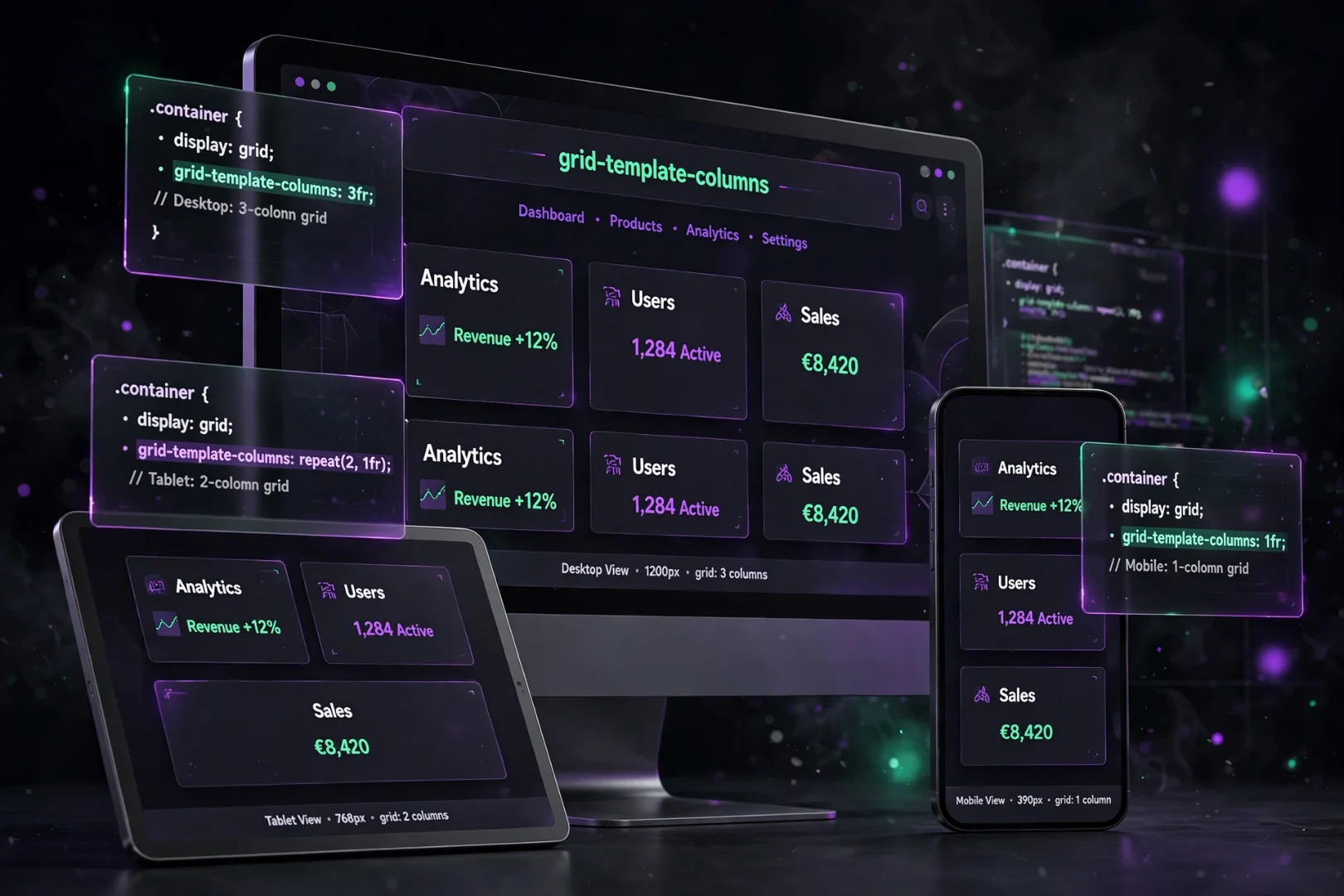
One feature that sets this tool apart is its built-in CSS generator.
After calculating a ratio, the tool automatically creates responsive CSS that developers can copy into their projects.
Instead of manually calculating percentages, the code is ready to use immediately.
This saves time when embedding videos, creating responsive containers, or maintaining consistent layouts across devices.
Built-In Presets
Instead of entering dimensions manually every time, the calculator includes presets for:
Smartphones
Tablets
Laptops
Desktop monitors
Ultrawide displays
Social media images
Cover photos
Cinema standards
This makes switching between projects much faster.
Who Can Benefit From This Tool?
Our Aspect Ratio Calculator is useful for:
Web Developers
Create responsive layouts, maintain image proportions, and generate CSS quickly.
UI/UX Designers
Ensure interfaces remain visually balanced across different devices.
Photographers
Crop photos without stretching or losing composition.
Video Editors
Maintain proper dimensions for YouTube, TikTok, Instagram Reels, and widescreen projects.
Content Creators
Prepare thumbnails, banners, and social media graphics using the correct dimensions.
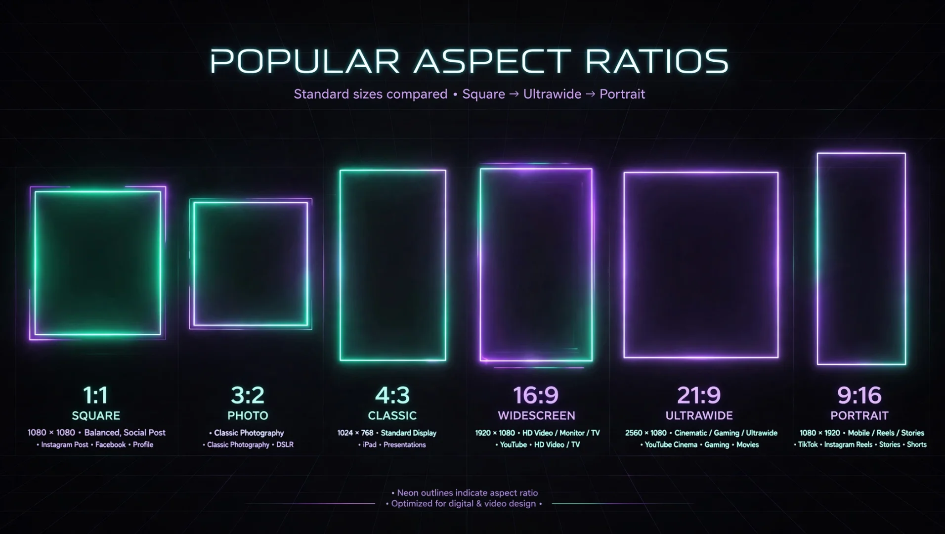
Common Aspect Ratios
Ratio | Common Use |
|---|---|
1:1 | Instagram posts |
4:3 | Traditional cameras and presentations |
16:9 | YouTube videos, HDTV, laptops |
21:9 | Ultrawide monitors and cinematic content |
9:16 | TikTok, Instagram Reels, YouTube Shorts |
3:2 | DSLR photography |
Common Mistakes When Resizing Images
Many people accidentally:
Stretch images instead of resizing proportionally.
Upload incorrect social media dimensions.
Ignore aspect ratios when cropping.
Confuse resolution with aspect ratio.
Design only for desktop screens.
Using an aspect ratio calculator eliminates these issues before they become noticeable.
Frequently Asked Questions
What is the most common aspect ratio?
Today, 16:9 is the most widely used ratio for televisions, computer monitors, YouTube videos, and many digital displays.
Can I calculate only the width or height?
Yes. The Find Missing Dimension mode calculates the missing value while preserving the selected ratio.
Does this tool work offline?
Yes. All calculations happen directly in your browser. Your data is never uploaded to a server.
Is the calculator free?
Yes. Like every tool on MiniToolkit, it is completely free to use.
Related Tools
If you're working with images or web content, you may also find these tools useful:
These tools complement the Aspect Ratio Calculator and help streamline image preparation and publishing.
Final Thoughts
Whether you're resizing a photo, preparing a YouTube thumbnail, building a responsive website, or comparing display sizes before buying a monitor, getting the aspect ratio right makes a noticeable difference.
Our Aspect Ratio Calculator combines ratio calculations, missing dimension solving, screen comparison, physical size calculations, responsive CSS generation, and visual previews into one easy-to-use tool. Everything runs locally in your browser, so your data stays private while calculations remain fast and accurate.
Try the calculator the next time you need to resize an image, compare displays, or build a responsive layout, and save yourself from distorted graphics and unnecessary guesswork.
Cipher
Founder & Lead Developer, ToolKit
Cipher is an independent developer who prefers to let the work speak for itself. They designed and coded every tool on ToolKit to ensure they remain fast, private, and beautifully designed for everyone. No fame, no face — just premium tools that work.